
MACD Histogram: Spotting Momentum Changes
Use the MACD histogram to spot momentum shifts—expanding/contracting bars, zero-line crossovers, and divergences to better time entries, exits, and risk.

The MACD histogram is a simple yet powerful tool for identifying momentum shifts in trading. It visually represents the gap between the MACD line and its signal line, helping traders spot trends gaining strength or losing momentum. Here’s the key takeaway:
Expanding histogram bars signal increasing momentum (positive or negative).
Contracting bars suggest weakening momentum, hinting at possible trend reversals.
Zero-line crossovers indicate shifts between bullish and bearish conditions.
Divergences between price action and the histogram can warn of trend exhaustion.
To use it effectively, monitor bar patterns, combine it with other indicators like RSI or volume, and customize settings based on your trading style (scalping or swing trading). The MACD histogram offers quick, actionable insights for traders aiming to time entries and exits with precision.
Does the MACD Histogram Hold the Secret to Anticipating Trend Changes?
How the MACD Histogram Is Built
Grasping how the MACD histogram is constructed helps you better interpret its signals and understand how it detects momentum shifts early. By breaking down its components, we can see how each piece contributes to the bigger picture.
Core Components of the MACD Histogram
The MACD histogram relies on three key components that work together to track momentum changes. Each one has a specific job, creating the visual representation traders use.
First, there’s the MACD line, calculated by subtracting the 26-period EMA (Exponential Moving Average) from the 12-period EMA:
MACD Line = 12-period EMA − 26-period EMA
The 12-period EMA reflects shorter-term price trends, while the 26-period EMA captures longer-term movements. The difference between these two averages reveals shifts in momentum over time.
Next is the signal line, which smooths out fluctuations by applying a 9-period EMA to the MACD line. This smoothing process helps filter out noise and provides a clearer reference for spotting potential buy or sell signals.
Finally, the MACD histogram measures the gap between the MACD line and the signal line:
Histogram = MACD line − Signal line
This difference is displayed as vertical bars that either rise above or drop below a zero line, offering a quick visual snapshot of momentum changes.
These components work together seamlessly. The MACD line points to the direction of momentum, the signal line confirms it, and the histogram shows the distance between the two. When the gap widens, the histogram bars grow taller; when it narrows, the bars shrink. This visual feedback makes it easier to spot whether momentum is building or fading in real time.
Reading Positive and Negative Bars
Now that we’ve broken down its components, let’s look at what the histogram bars actually tell us. These bars reflect market momentum, with the zero line acting as the dividing line between bullish and bearish conditions.
Positive bars, which appear above the zero line, indicate that the MACD line is above the signal line. This signals upward momentum and a bullish market. As the bars grow taller, it suggests growing buying pressure and stronger bullish sentiment.
Negative bars, found below the zero line, mean the MACD line is below the signal line. This signals downward momentum and bearish conditions. Deeper negative bars suggest increasing selling pressure and stronger bearish momentum.
The height of the bars matters, too. Larger bars - whether positive or negative - indicate strong momentum, while smaller ones suggest weakening momentum. When the bars reach their tallest or deepest points, the gap between the MACD and signal line is at its widest, signaling peak momentum.
A zero-line crossover happens when the MACD line intersects the signal line, leaving the histogram value at zero. If the MACD line crosses above the signal line, the histogram shifts from negative to positive, signaling growing bullish momentum. Conversely, a cross below the signal line flips the histogram from positive to negative, indicating downward momentum is taking hold.
Even when the bars stay on one side of the zero line, their size provides important clues. Shrinking bars suggest the gap between the MACD line and the signal line is closing, hinting that momentum is weakening. For instance, if prices are climbing to higher highs but the histogram bars are forming lower highs, this divergence could signal growing selling pressure and a potential reversal. Catching these early warnings can help you adjust your strategy, such as tightening stop-losses or preparing for a breakout before a full crossover happens.
Because the histogram bars oscillate around the zero line, they provide straightforward, visual signals. This makes the MACD histogram a reliable tool for identifying entry and exit points based on clear, objective data.
How to Spot Momentum Changes
Understanding the MACD histogram can help you detect shifts in market momentum before they become apparent on a price chart. By analyzing the bar patterns, you can gauge whether a trend is gaining strength, losing steam, or preparing to reverse. This section focuses on three key patterns - expanding and contracting bars, zero-line crossovers, and divergences - that provide early clues about momentum changes. These insights can help you adjust your trades proactively.
Expanding and Contracting Bars
The height of the histogram bars reflects the strength of market momentum. When the bars grow taller, it means the gap between the MACD line and the signal line is widening, signaling stronger momentum in the trend’s direction. Expanding bars, whether positive or negative, indicate increasing momentum.
On the other hand, when bars start to shrink, it suggests the MACD and signal lines are converging, which means momentum is weakening. For example, if a stock is hitting new highs but the histogram bars are getting shorter, it could be a sign that bullish momentum is fading. This might indicate a potential reversal or consolidation phase.
Keeping an eye on these patterns can give you an edge in spotting trends before they reverse. If you notice significant bar contraction during a strong price move, it might be time to tighten stop-loss levels, scale back your position, or prepare for a breakout.

Crossovers and Zero-Line Signals
The zero line on the MACD histogram acts as the dividing line between bullish and bearish momentum. When the histogram crosses above zero, it signals a bullish shift, as the MACD line moves above the signal line. Conversely, a crossover below zero indicates bearish momentum, with the MACD line falling below the signal line.
These crossovers are often used by traders to time their entries and exits. For instance, buying when the histogram moves above zero and selling when it dips below can be an effective strategy. However, in sideways or choppy markets, these signals can sometimes be unreliable. To avoid false signals, it’s a good idea to confirm crossovers with additional indicators or price action analysis.
Divergences as Early Warning Signs
Divergences occur when the price movement and the histogram tell two different stories. These discrepancies can reveal hidden momentum shifts and often serve as early indicators of trend exhaustion or reversals.
A bullish divergence happens when the price makes lower lows, but the MACD histogram forms higher lows. This suggests that while prices are dropping, selling pressure is easing, and an upward reversal could be on the horizon. Conversely, a bearish divergence occurs when the price hits higher highs, but the histogram shows lower highs. This pattern indicates that upward momentum is fading, potentially signaling a downward reversal.
Divergences are powerful early warning signs, but they work best when confirmed by other tools or price action. Waiting for additional validation can help you make more confident trading decisions.
These momentum patterns pave the way for developing more precise trading strategies, which will be explored in the next section.
Building a Trading Strategy With the MACD Histogram
Creating a trading strategy using the MACD histogram involves setting clear, rules-based guidelines. This approach ensures you know exactly when to enter, exit, and manage risk before placing a trade. By sticking to these rules, you can avoid the emotional decisions that often lead to poor performance.
Using the previously discussed histogram patterns, this strategy defines specific entry, exit, and position sizing rules. The goal is to translate the signals from the MACD histogram into actionable trades. The foundation of this method lies in defining objective, repeatable conditions that work across various market scenarios.
Entry and Exit Criteria
Entry signals should be straightforward and easy to identify. A common approach is to buy when the histogram crosses above the zero line, signaling upward momentum. This crossover is a bullish indicator and often a good point to initiate a long position.
For added confidence, wait until the histogram bars start expanding positively after the crossover. This expansion suggests that momentum is not only positive but also accelerating. On the other hand, if the bars cross above zero and then start shrinking, the signal may lack strength and could reverse.
To filter out false signals, some traders combine the histogram crossover with other indicators. For instance, you might only enter a trade if the histogram crosses above zero and the price is trading above the 50-day moving average. This ensures your trade aligns with the broader trend, increasing the likelihood of success.
Exit signals are equally important. The main exit point occurs when the histogram crosses back below the zero line, indicating downward momentum. This is the time to close long positions, regardless of profit or loss.
Set stop-loss levels based on recent price action. A practical method is to place your stop slightly below the most recent swing low, adjusted for volatility. For take-profit targets, use prior resistance levels or a risk-to-reward ratio of at least 2:1. If divergence patterns appear, consider tightening your stop to protect gains.
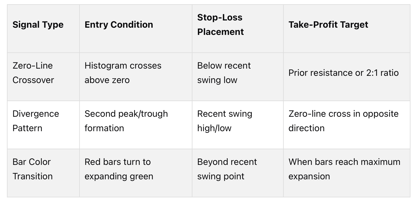
Position sizing should adapt to the histogram’s behavior. When bars are expanding significantly, it indicates strong momentum, so you can use your standard position size. If the bars start contracting, even without crossing zero, it signals weakening momentum. In this case, reduce your position size by 25-50% or prepare to exit.
Combining the MACD Histogram With Volume Analysis
Volume analysis can strengthen the reliability of your histogram signals. Volume acts as a confirmation tool, as genuine momentum shifts are typically accompanied by increased trading activity. For example, when the histogram crosses above zero, it’s more reliable if there’s a spike in trading volume, indicating strong buyer participation. A crossover on low or declining volume, however, might be a false signal that could reverse quickly.
A useful rule is to require volume to be above the average of the previous 20 periods before entering a trade based on a histogram signal. This simple filter can help avoid trades during low-conviction moves.
When histogram bars are expanding, they should align with increasing volume in the trend’s direction. If the bars grow taller while volume declines, it suggests the momentum may not hold, potentially leading to a reversal or consolidation.
Volume spikes during zero-line crossovers provide stronger entry opportunities. For instance, if the histogram crosses above zero and volume jumps to 150% of its 20-day average, this indicates significant participation. However, if the crossover occurs with volume at just 60% of the average, it may signal retail-driven activity with limited follow-through.

Watch for volume divergence alongside histogram patterns. For example, if the histogram makes higher highs while volume declines, it suggests the rally is losing strength despite the indicator’s bullish appearance. This divergence often signals an upcoming reversal, making it a good time to tighten stops or exit positions.
A trading system that combines MACD histogram signals with volume analysis can significantly improve accuracy and reduce false signals. Treat volume as a required confirmation rather than an optional factor. When both the histogram and volume align, the chances of a successful trade are much higher.
For more reliable signals, use daily chart timeframes rather than shorter intervals like 5-minute or 15-minute charts. Short-term traders should align their timeframe - whether it’s 4-hour, 1-hour, or 30-minute charts - with their specific goals. Longer timeframes capture broader trends, while shorter ones focus on quick momentum shifts.
Adjusting the MACD Histogram for Different Trading Styles
Once you’ve established a rules-based trading strategy, it’s time to fine-tune the MACD histogram to match your trading style. The MACD histogram isn’t a universal tool that fits all approaches. Different traders operate on varying timeframes and with different goals, so customizing the indicator’s settings is crucial - whether you’re holding positions for just a few minutes or several weeks.
The key lies in understanding how adjusting the periods impacts the frequency and reliability of signals. Shorter settings make the histogram more responsive, generating more signals but also increasing the likelihood of false ones. On the other hand, longer settings filter out market noise, producing fewer but generally more reliable signals.
Default Settings and Their Applications
The standard MACD histogram uses these settings:
12-period EMA for the short-term trend
26-period EMA for the long-term trend
9-period EMA as the signal line
These default parameters strike a balance between responsiveness and filtering out minor price fluctuations, making them a solid starting point for most traders. For beginners, sticking with the 12, 26, 9 setup is often the best choice until you have a clear reason to adjust them.
However, the default settings aren’t ideal for every trading style. Day traders and scalpers often find them too slow to capture rapid momentum shifts, while long-term investors may feel they’re too sensitive, reacting to minor moves that don’t impact their broader strategies. To address this, you can adjust the settings for faster-paced scalping or slower, trend-focused swing trading.
Customizing for Scalping or Swing Trading
Scalping requires faster signals to take advantage of quick price movements, often within minutes or even seconds. Shorter MACD periods, such as 5, 13, 5 or 8, 17, 9, make the histogram more sensitive to price changes. This increased sensitivity allows scalpers to identify entry and exit points earlier. However, this comes with a trade-off: more false signals. To mitigate this, scalpers often use additional tools like volume spikes or support and resistance levels to confirm signals.
Swing trading, on the other hand, focuses on intermediate-term trends and aims to filter out intraday noise. Extending the MACD settings to 20, 40, 9 or 25, 50, 9 smooths out the histogram, highlighting only the most meaningful momentum shifts. Swing traders may also lengthen the signal line period to 12 or 14, reducing the number of crossover signals and ensuring trades are based on significant trend changes.
Here’s a quick comparison of the two styles:

Fine-Tuning and Testing
Adjusting MACD settings is simple on most trading platforms. Right-click on the histogram, choose “Edit Study” or “Settings”, and update the period values. Once you’ve made changes, backtest your new settings across different timeframes and market conditions. Look at factors like the number of false signals, average trade profitability, and how well the signals align with actual trend reversals.
Pay close attention to the size and frequency of the histogram bars. If the bars appear too small or too frequent, your settings may be overly sensitive. Conversely, if the bars are too large or infrequent, you could miss key momentum shifts. The goal is to calibrate the settings so the histogram aligns with your trading frequency and the market conditions you typically encounter.
Avoiding Common Mistakes
One common pitfall is over-optimizing settings based on historical data. While backtesting can provide valuable insights, markets are constantly evolving, and what worked in the past may not hold up in live trading. Another mistake is setting periods too short, which can lead to excessive false signals and reduced returns due to commissions and slippage. Always test your adjustments in both trending and ranging markets to ensure they’re versatile.
Finally, remember that the MACD histogram works best when paired with other indicators. Scalpers might combine it with tools like the Relative Strength Index (RSI) or volume analysis to confirm rapid signals. Swing traders, on the other hand, often use moving averages alongside the histogram to validate trend direction. By combining the MACD with complementary indicators, you can improve the accuracy and reliability of your trading signals.
Conclusion
The MACD histogram is a standout tool for spotting momentum shifts in the market. By showing the difference between the MACD line and its signal line, it offers a clear visual representation of momentum changes. This makes it easier to pick up on shifts faster than relying solely on the traditional MACD indicator. Larger bars on the histogram suggest stronger momentum, while shrinking bars hint that the current trend might be losing strength - even before a crossover at the zero line occurs.
Here are three key takeaways to keep in mind:
The histogram delivers quicker, more responsive signals compared to standard MACD crossovers, helping you spot trend changes earlier.
Expanding bars indicate increasing momentum, while contracting bars suggest weakening trends - a useful cue to tighten stop-losses or adjust position sizes.
Divergences between the histogram and price action often point to trend exhaustion and potential reversals.
For better accuracy, it’s smart to combine the MACD histogram with other technical tools. On its own, the histogram can produce false signals, especially in choppy or sideways markets. Pairing it with indicators like the Relative Strength Index (RSI), moving averages, or volume analysis can help confirm signals and reduce noise. For example, a bullish MACD crossover is much more reliable when the RSI indicates oversold conditions (below 30) and the price holds above the 50-day moving average. This multi-indicator approach narrows your focus to high-probability opportunities.
The MACD histogram is flexible enough to fit any trading style. While the default settings (12, 26, 9) work well for most traders, you can tweak these parameters to suit your trading frequency and risk preferences. Just make sure to backtest any adjustments across different market scenarios before applying them to live trades.
FAQs
How can I use the MACD histogram with other indicators to improve my trading strategy?
The MACD histogram is excellent for spotting shifts in momentum, but its true potential shines when combined with other indicators. For instance, pairing it with the Relative Strength Index (RSI) can confirm whether an asset is in overbought or oversold territory. Similarly, aligning it with support and resistance levels can help identify potential entry or exit points in your trades.
Blending the MACD histogram with other tools allows for a deeper analysis and more informed decisions. Just make sure your strategy fits your overall trading goals and risk tolerance to get the most out of this approach.
What are some common pitfalls to avoid when analyzing the MACD histogram across different trading strategies?
When using the MACD histogram, one pitfall is depending on it exclusively, without factoring in other indicators or market dynamics. While the histogram is great for identifying momentum shifts, it delivers better results when paired with tools like support and resistance levels or trendlines.
Another mistake traders often make is misjudging the timing of signals. For instance, acting too quickly on a histogram change without waiting for price action to confirm can lead to hasty and poorly-timed decisions. Exercising patience and validating signals properly can help you steer clear of false moves.
Finally, keep your strategy simple. The MACD histogram shines when used in a clear and disciplined manner. Overanalyzing or trying to react to every minor fluctuation can lead to confusion and inconsistent outcomes.
What’s the difference between adjusting MACD histogram settings for scalping versus swing trading?
The main distinction comes down to the timeframes and how sensitive the settings are. For scalping, traders rely on shorter timeframes and tweak the MACD settings to respond faster. This often means shortening the periods for the fast and slow EMAs, making the histogram more sensitive to quick, short-term momentum changes. The goal? To seize small price movements in a matter of minutes or hours.
On the other hand, swing trading aims to capture larger price shifts that unfold over several days or even weeks. Here, traders prefer longer MACD settings. These smoother settings help filter out the day-to-day noise, offering a clearer view of significant momentum shifts and broader market trends.
By tailoring the MACD settings to match your trading approach, you can interpret the histogram more effectively and make decisions with greater confidence.